
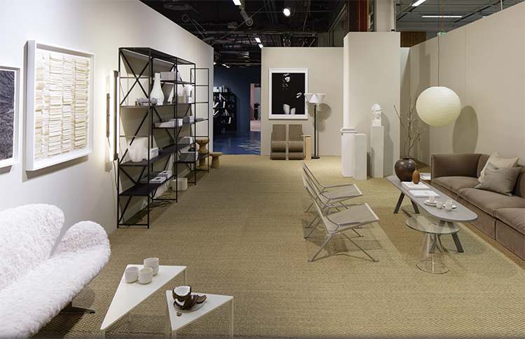
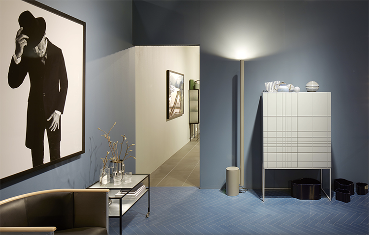
During the last edition of Stockholm Design Week the Sweden stylist Lotta Agaton created the underlying theme “Contrasts” for Furniture & Light Fair’s Trend Exhibition 2017/18. The exhibition’s idea is conceived on five different darkly hued rooms in which contrasts between materials and furniture creates surprising combinations.
This aesthetic choice is linked to the historical and socio-economic period we are living, about this the stylist says: “During recent years of stability and safety, we have had bright white spaces that are open for exposure. But in darker times when the political and economic climate get more uncertain, you want to nest a little bit.”
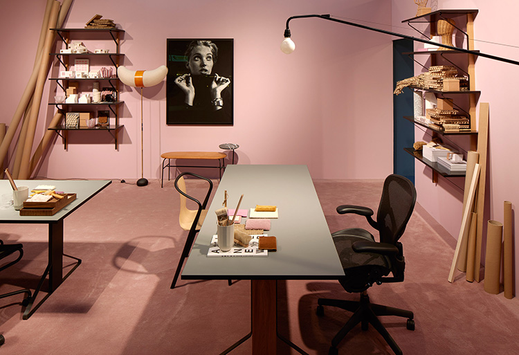


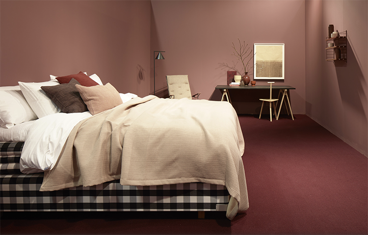
This concept took the form of six tone-on-tone rooms characterized by bold and rich colors, among which pink assume an important rule for a “think positive” attitude. The interior designer predicted the traditionally feminine colour could become more popular as a backlash to the hypermasculine culture surrounding Trump and his supporters.
“It is interesting to think about the impact Trump will have on trends,” she said. “Is it not going to be so manly? Are we going to get pink offices? I think interiors reflect those big political changes.”
Another visible trend is that the line separating residential from public interiors is being erased, so more and more often it creates a mix of styles.
Photos via Dezeen